Functionality of charts
Dashboards provide multiple charts that can provide functionality. For example, values can be filtered to adjust the chart accordingly, or elements of a diagram can be separated to focus on them.
The functionality available depends on how dashboards and charts are configured. The following description shows examples of the functionality that can be available. The list considers the charts of the delivered default dashboards of the Sample DB database.
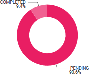
You can click a chart element to separate and select it. The coloring is changed. If it can be separated, it will be isolated.
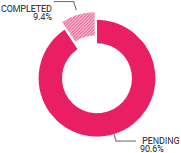
Click in the chart background to reintegrate the separated chart element.
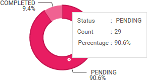
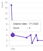
Move the mouse pointer over a chart element to get detailed information. Depending on the chart type, the chart element for which the information is displayed is indicated by a dot or enlarged.
A  down arrow indicates that a chart menu is available for a chart. To open the chart menu, click the down arrow.
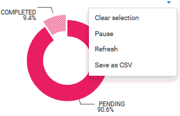
Click Clear selection to reintegrate or deselect the chart element.
Click Pause to interrupt data reception for the chart. Click Resume to allow data reception for the chart again.
Click Refresh to update the chart with the current data.
Click Save as CSV to save the data of the chart to a Comma Separated Values file. You can use this file to pass the chart data to other applications.
You can filter chart values, for example, by period or quantity.
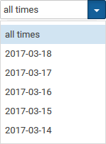
You can limit the values for all charts of a dashboard simultaneously using the filter panel.

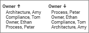
You can click the column headers to sort entries in ascending and descending order. The order is indicated by an arrow. The up arrow shows the ascending order, the down arrow the descending order.
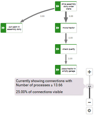
You can use the slider to adjust the displayed connections and thus reduce or enlarge the number of displayed objects. If connections are faded out or displayed, the corresponding objects are also faded out or displayed.
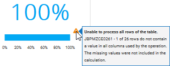
If no complete values could be determined that are required to display a correct result, a warning icon is displayed. Move the mouse pointer over the warning icon for detailed information.
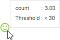
You can display the current value and the threshold to which the value is compared.
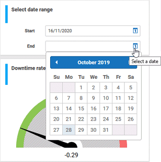
You can select a data range to restrict the displayed data to a specific period.